Movement Analytics
Location: Dashboards → Real-Time Tracking → Movement analytics, or the Movement analytics button in an asset's detail panel
Movement Analytics follows one asset or tag over time. Real-Time Tracking answers where is it now — Movement Analytics answers where has it been, when did it move, and where did it stand still.
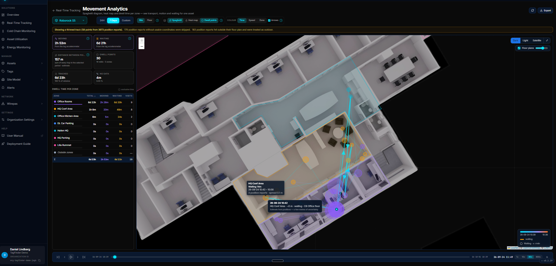 The path over a floor plan, coloured by time. Hovering a segment shows the zone, the time, and how the position was estimated.
Opening the page
Three ways in:
- Real-Time Tracking → the Movement analytics tab at the top of the page
- Real-Time Tracking → click an asset → Movement analytics in the detail panel (the asset follows you into the page)
- Assets → open an asset → Movement analytics under Position & Movement
Use the asset picker in the header to switch to another asset without leaving the page.
Time range
| Range | Use it for |
|---|---|
| 24H | A single day in detail — the finest heat map cells and the fullest path |
| 7 Days | A working week: recurring routes, where the asset is parked overnight |
| Custom | Any period up to 7 days |
Why seven days
A longer window would thin the path so heavily that the detail you came for disappears, and the query would take long enough to feel broken. Pick the week you care about instead.
A yellow banner above the map tells you when the track was thinned, when position reports had no usable coordinates, and when reports fell outside their floor plan and were treated as outdoor.
Layers
Three layers can be on at the same time:
- Spaghetti — the actual path, drawn segment by segment. Arrows adds direction of travel on the moving stretches.
- Heat map — where time was spent, as a colour wash. See Heat map below.
- Dwell points — a circle at every place the asset stood still. The circle grows with the length of the stay; click one to jump the playback there.
Path colour
| Mode | Meaning |
|---|---|
| Time | Cyan at the start of the period, orange at the end — shows the order of the route |
| Speed | Cyan is slow, red is fast — shows where the asset was carried or driven |
| Zone | Each geofence's own colour |
Yellow always means waiting, in every colour mode.
Heat map
The heat map is gridded for the part of the map you are looking at, and is recalculated when you pan or zoom. Zoom into one building and the cells become small and detailed; zoom out over several sites and they grow to cover the whole area. The colour scale follows the view too, so a busy corner stays readable even when the asset spent most of the period somewhere else entirely.
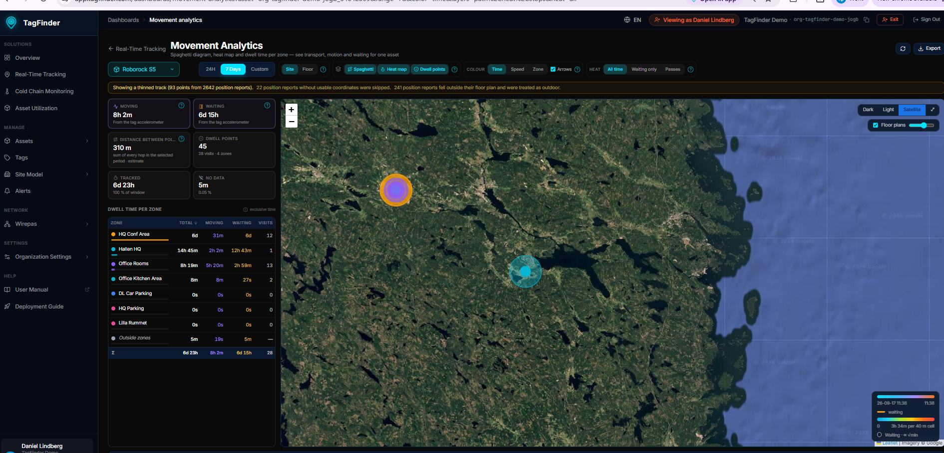 Zoomed out over a week: two separate places the asset spent time, with the legend showing what the top colour is worth at this zoom.
Three weightings:
| Weighting | Each cell shows |
|---|---|
| All time | Every second spent in the cell |
| Waiting only | Only the time the asset stood still — finds the parking spots |
| Passes | How many times the path crossed the cell — finds the traffic routes |
The legend at the bottom right always states the unit and the cell size for the current zoom.
Key figures
| Card | What it is |
|---|---|
| Moving | How long the tag itself reported movement, measured by its accelerometer |
| Waiting | How long the tag reported in while the accelerometer saw no movement |
| Distance between points | The sum of every hop between consecutive positions — an estimate, not an odometer |
| Dwell points | Number of places the asset stood still, with visits and zones covered |
| Tracked | How much of the period is covered by data |
| No data | Time with no reports at all — a tag switched off is never counted as waiting |
Measured, not guessed
Moving and Waiting come from the accelerometer on Wirepas EverTag mesh tags, the same figures as Equipment & Asset Utilization. Tags without an accelerometer fall back to an estimate from the positions, and the cards say so.
Dwell time per zone
The table on the left lists every geofence with Total, Moving, Waiting and Visits, and a Σ row that adds up to the tracked time. Time is exclusive: each moment is counted to one primary zone, so the column totals mean something.
Click a zone to fly the map to it and show only that part of the path. Click it again to clear the filter. The Outside zones row covers time the asset was not inside any geofence.
Playback
The timeline under the map replays the period:
- Play/pause with the button or the space bar
- Speed 1× to 600×
- Drag the handle to scrub to a moment; the map marker follows
- Step forwards and backwards with the arrow buttons
Map background and floor plans
Dark, Light and Satellite backgrounds are available at the top right, and your choice is remembered. Floor plans overlays the calibrated plans with an opacity slider, so an indoor path can be read against the actual rooms.
Export
The Export menu offers two CSV files for the selected asset and period:
- Time in zone — one row per geofence with total, moving and waiting time
- Dwell ledger — one row per stay, with arrival, departure and duration
Accuracy
- Indoor positions come from the Wirepas mesh and carry a few metres of uncertainty. A path can therefore wander slightly even when the asset stood still.
- The track is thinned before it is drawn. The figures on the cards are calculated on the full data, not on the thinned path.
- Floor view — the upright single-floor view is coming in a later version; the Site view already draws floor plans in place on the map.
Related
- Real-Time Tracking — the live map this page is reached from
- Equipment & Asset Utilization — the same accelerometer figures across the whole fleet
- Geofences — the zones the dwell table is built on